
Teaching Resources
Mapping the Great Horse Flu: Epidemiological Cartography
Map, animation, and methodology courtesy of PhD candidate Maggie McNulty.
Below, the spread of the Great Horse Flu across North America is mapped in two different styles. First, heatmaps trace the disease’s movements across the northern and eastern portions of North America. Second, “point” maps trace the epizootic across the West and Mexico. Each style has different benefits and drawbacks, and each is appropriate for the geographical region it depicts for distinct reasons. In particular, the different map styles convey the disparity in population density between the eastern and western halves of the continent. Given that horse-to-horse contact was the predominant disease vector for the epizootic, such a stark contrast in equine population density between East and West meant that the outbreak assumed distinctive contours in different regions.
In the growing metropolitan areas of the Midwest and East around Toronto, New York, Boston, and Chicago, newspapers recorded the influenza virus’s arrival and spread. Heatmaps obscure the specificity of these local epidemiological dynamics, but they accurately convey the disease’s movement through more densely populated and interconnected regions.
In the more rural and less densely populated areas of the American West and Mexico, the disease still spread horse-to-horse but the scattered nature of settlement meant that reports of the Great Horse Flu’s arrival are much more dispersed across time and space. For these regions, a series of legible maps tracing individual outbreaks over the months of the epizootic’s spread is possible. In experimental heatmaps produced for this study on the West and Mexico, the recorded cases were so farflung that the mapping software produced a thin cloud over the region that 1) failed to accurately convey the movement of the epizootic and 2) misleadingly suggested that the outbreak had an equal impact on rural, urban, and Indian Country equine populations.
Between 1872 and 1873, a new variant of equine influenza thundered across North America. The disease infected millions of equines as it spread animal to animal across Canada, the United States, Mexico, Cuba, through parts of Central America and even as far as Hawaii.
Nineteenth century maps produced soon after the epizootic, such as Adoniram B. Judson’s 1874 map, represent the epizootic’s path taking the form of uniform bands from northeast Canada to Washington state. However, when the approximately 1,696 cases with location and date information are mapped using GIS software, a different image takes shape. This form of digital mapping illustrates the disease’s spread not in uniform bands, but in clustered spatial patterns in the Northeast and at an uneven pace as the influenza moves West.
Use the links below to see regional maps of the epizootic’s spread across North America!
Continental Maps — Click Through!
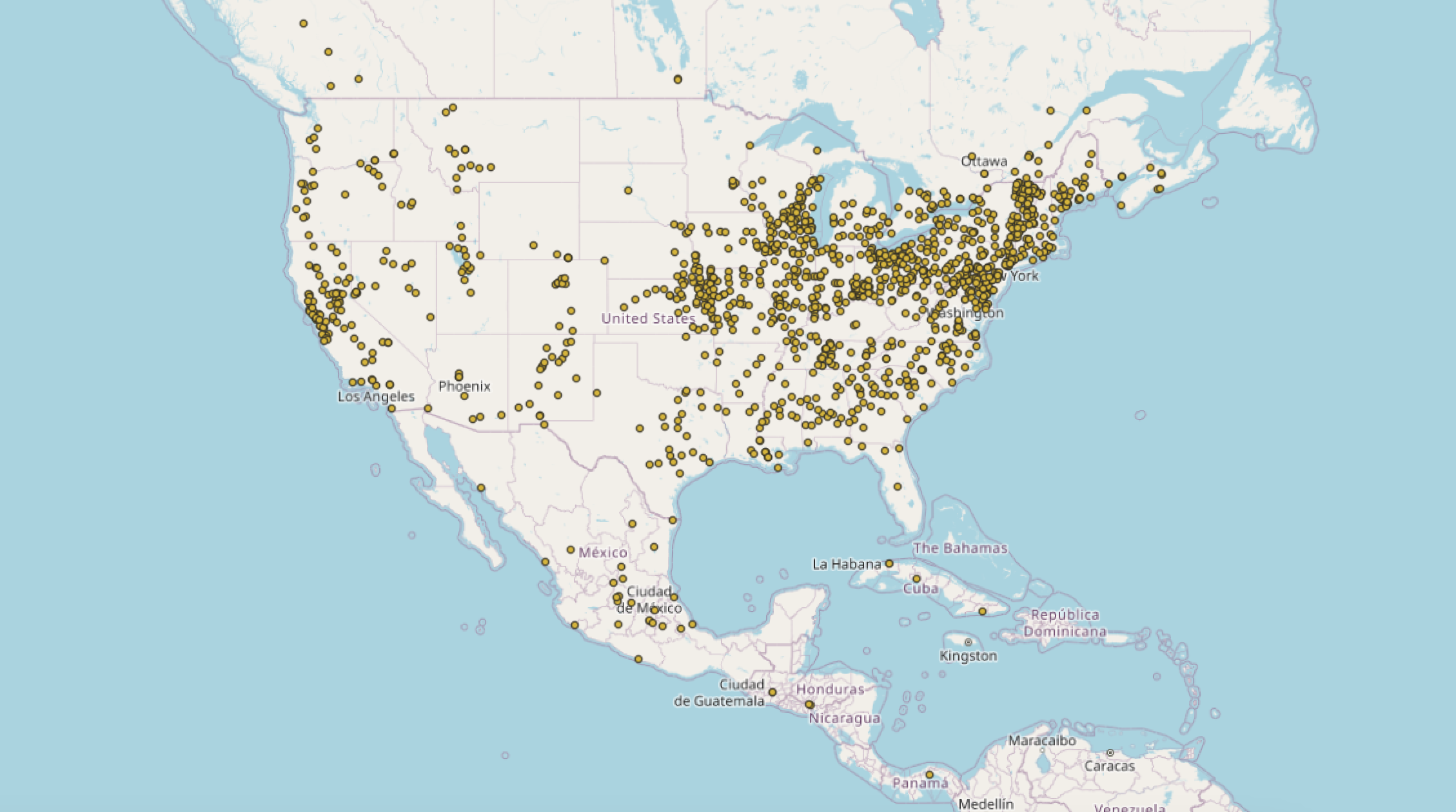
QGIS Data of Epizootic Outbreaks
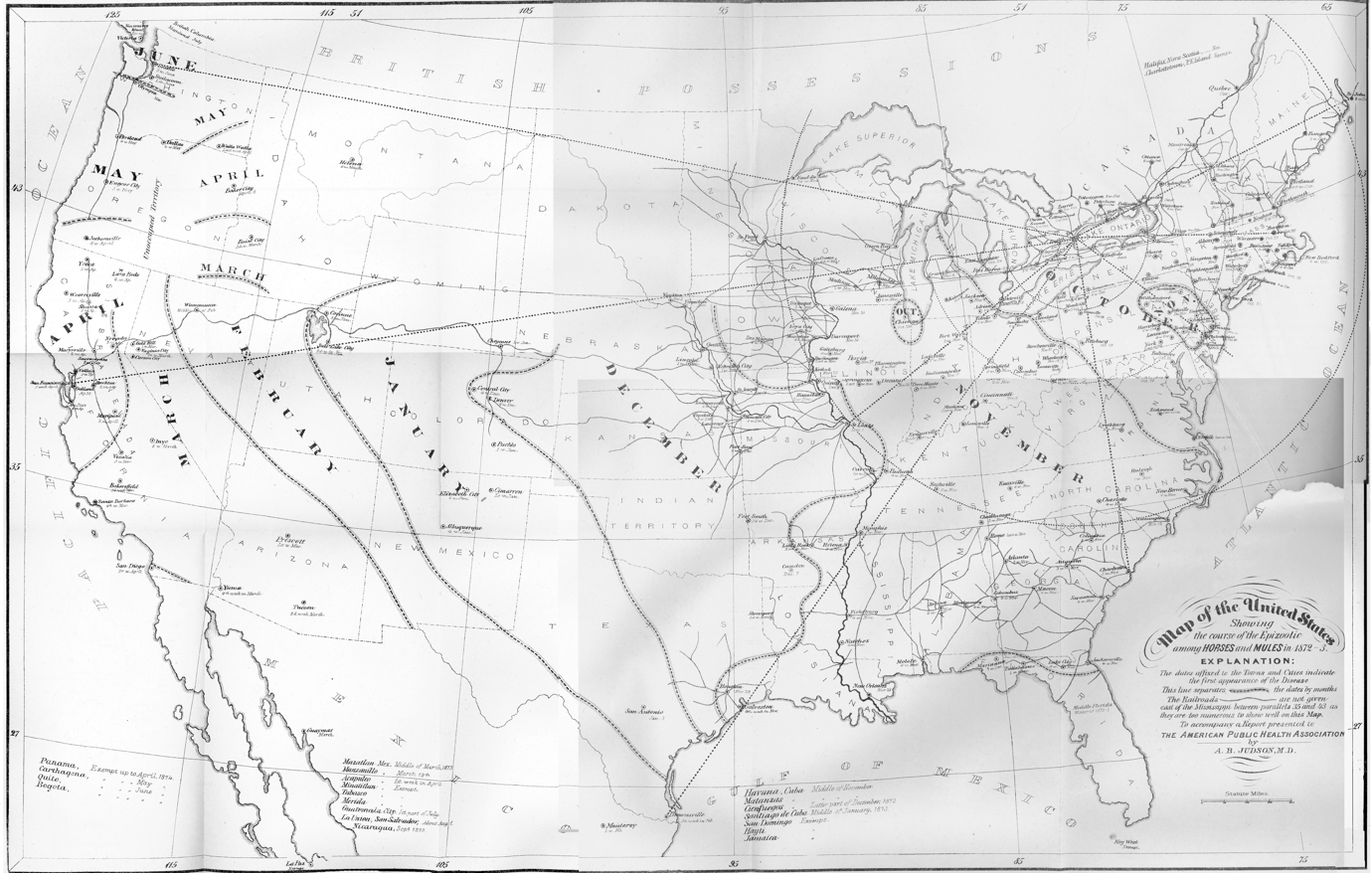
Adoniram B. Judson's 1873 map, showing the month-by-month spread of the epizootic.
Eastern North America: Oct. 1872 - Dec. 1872 — Click Through!
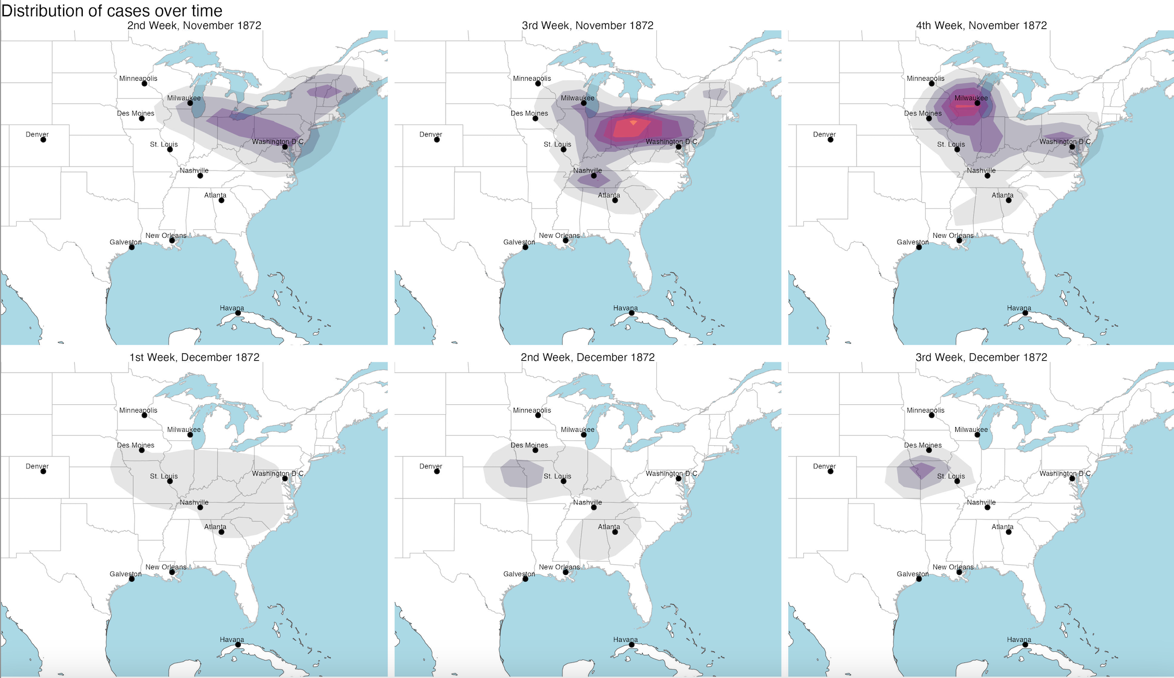
Eastern North America
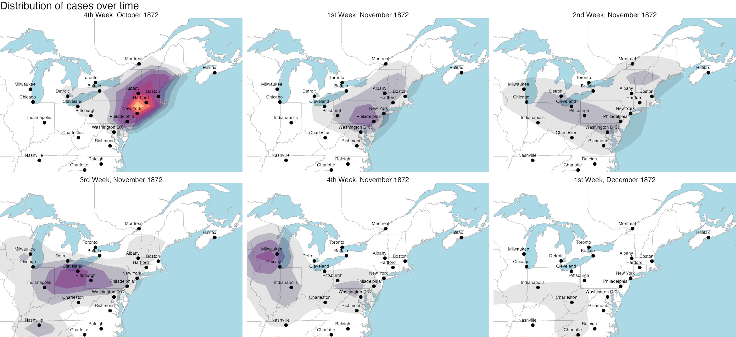
Broad Northeast
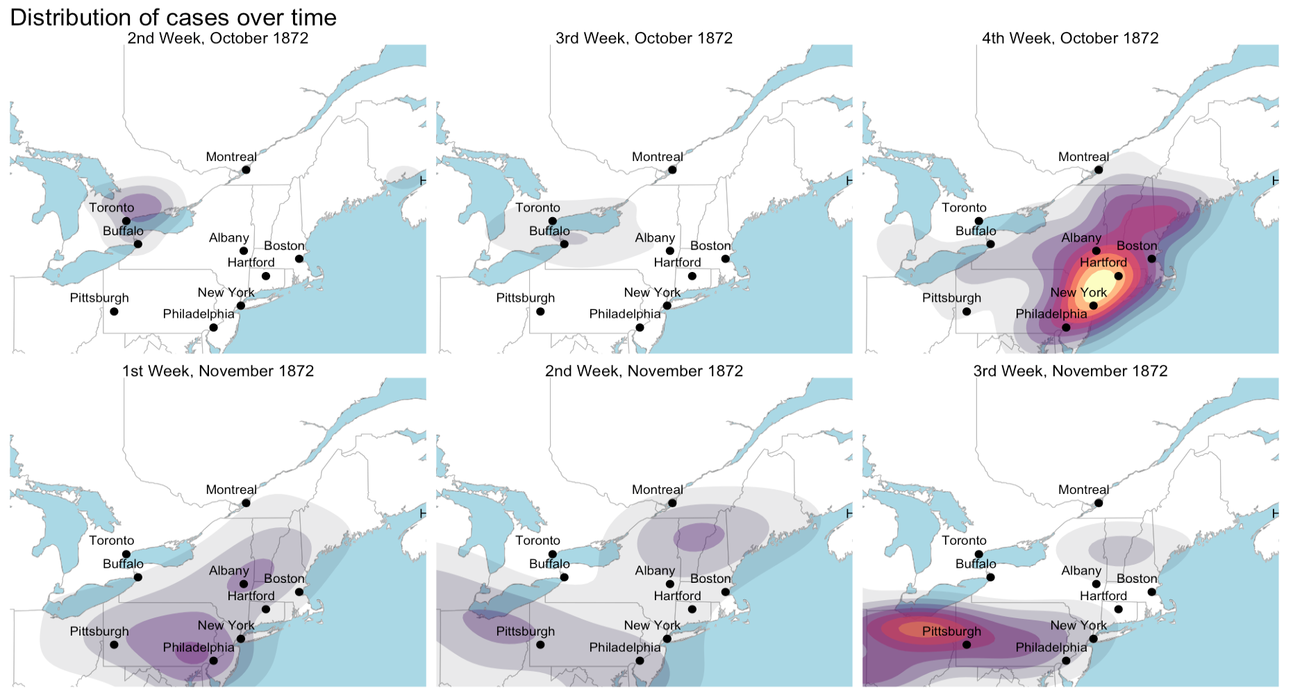
Tight Northeast
Intermountain West: Dec. 1872 - Apr. 1873 — Click Through!
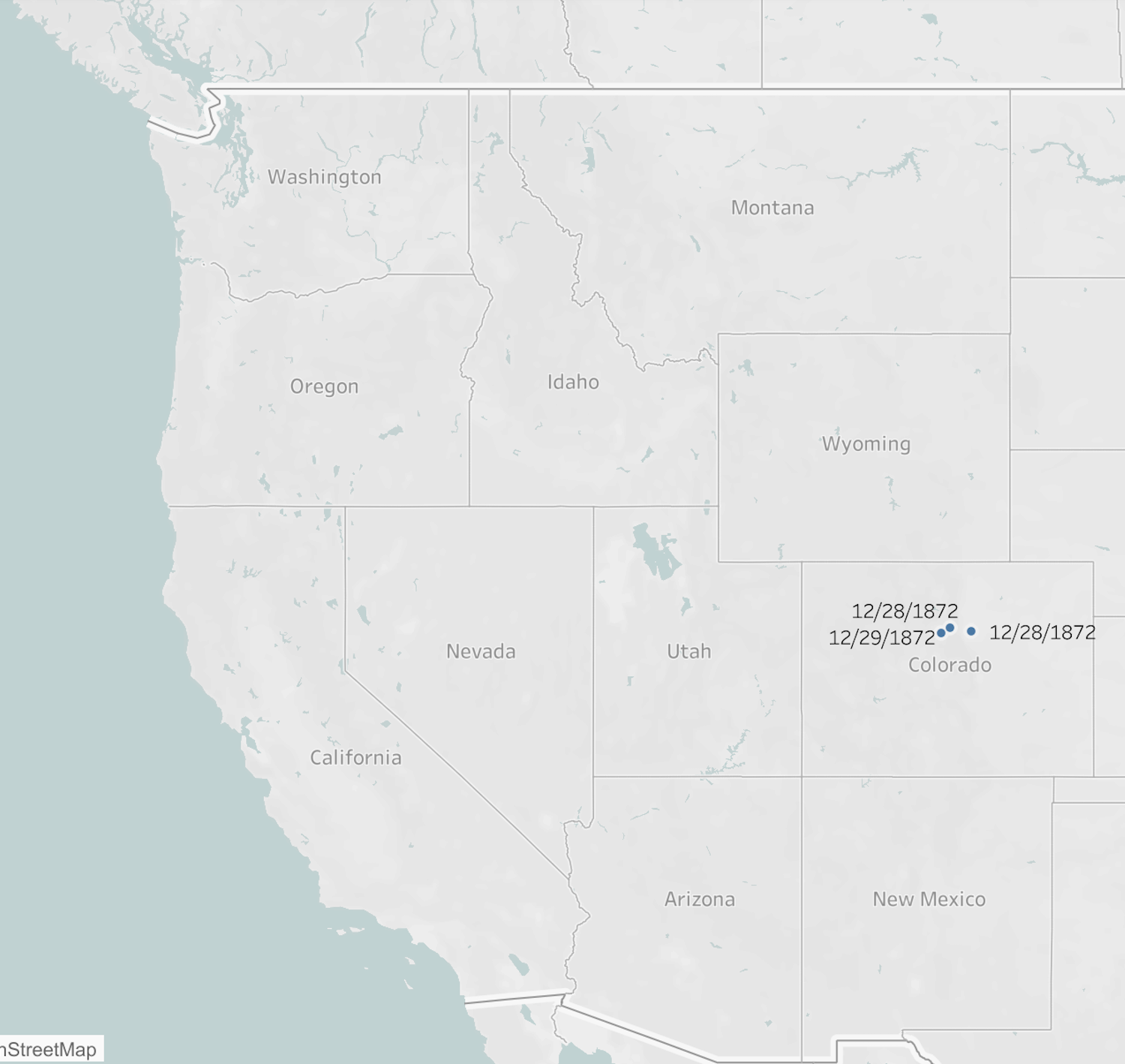
December 1872
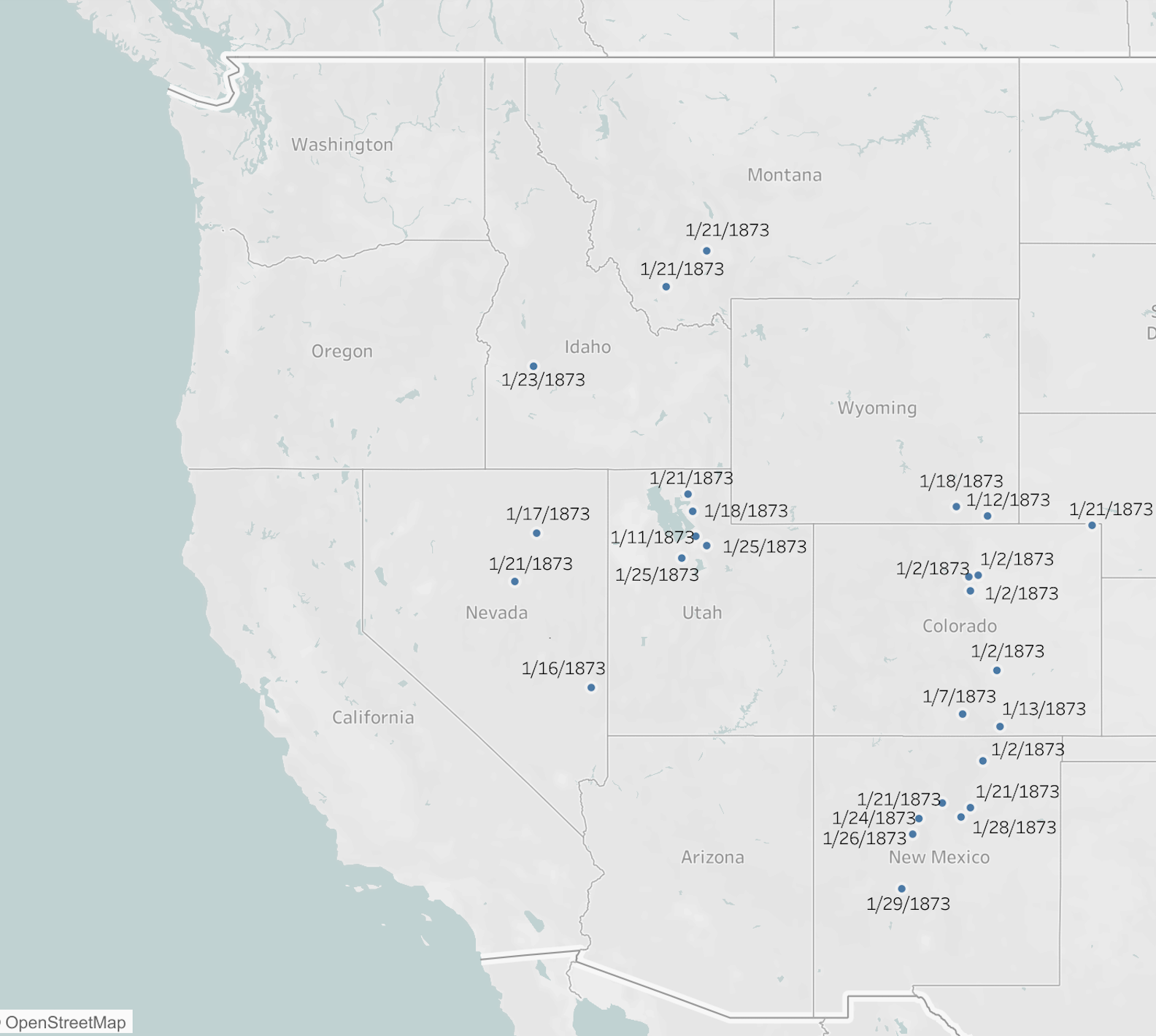
January 1873
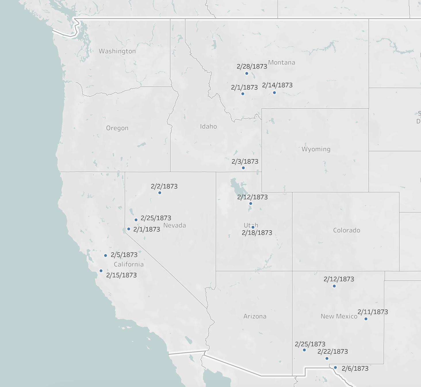
February 1873
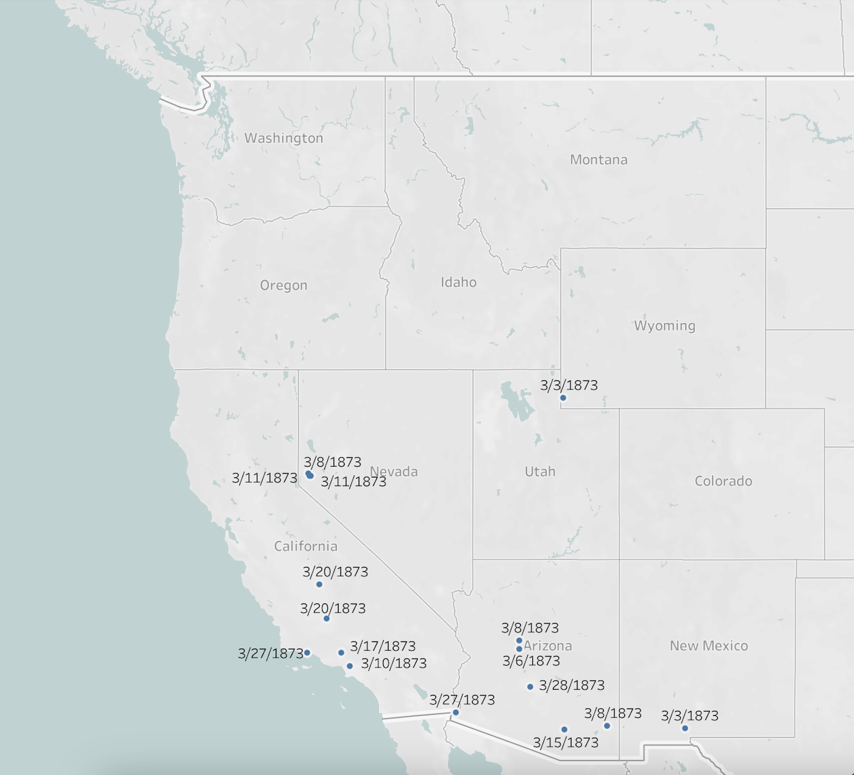
March 1873
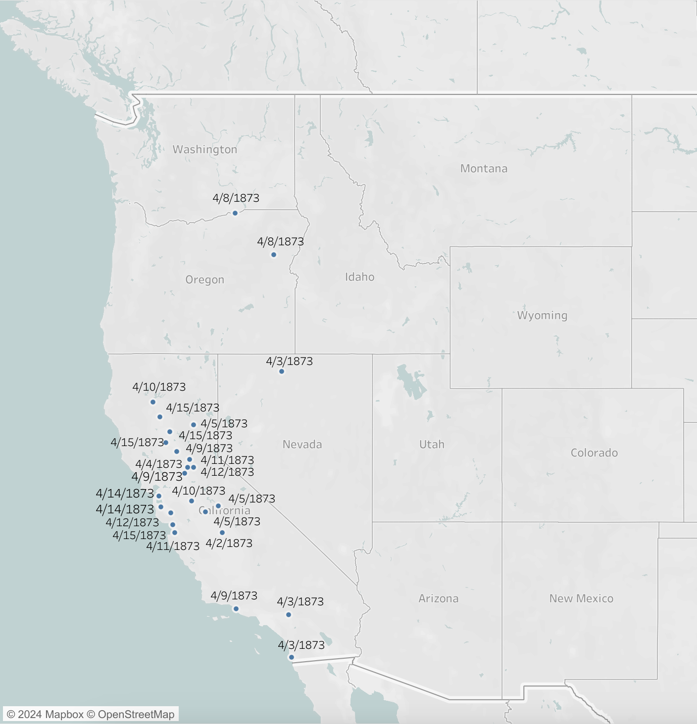
First Half of April 1873
Mexico: Feb. - Aug. 1873 — Click Through!
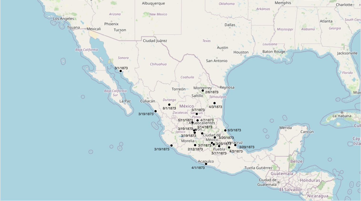
Mexico Feb - Aug 1873
GIS Data
Interested in tracing the course of the disease yourself?
Have a look at the data! Dr. Kerri Keller and PhD candidate Maggie McNulty compiled these maps using data from over 1600 recorded cases from newspapers across North America.